When looking at various vodka bottles, one can quickly notice that sans serif typefaces are almost always used. If not in all of the typography on the packaging, sans serif faces are often used in the word ‘vodka.’ It does seem to fit, too. The clean look of a sans serif font works well with the clean look of the clear alcohol. After doing some research, I discovered that the reason designers use sans serif typefaces for vodka packaging is in fact because it will fit with the pureness of the product itself. Graphics and typography are often skinned down to be clear and clean, just as vodka is clear and clean. An aged look and feel would not work for vodka typography like it would for scotch. Scotch itself is usually aged so the nostalgic typefaces fit well with scotch packaging. However, since vodka is pure and clean, sans serif faces and minimal graphics convey the product’s meaning quite effectively.
 |
| Effen Vodka |
Absolut, the world’s leading vodka manufacturer, has not changed their typography since the beginning. Their stance on it is if it works, why change it? Even after Absolut came out with completely redesigned bottles that featured artful elements, their typography remained unchanged. This is effective not only for brand recognition, but it is also effective in just creating an extremely strong and powerful brand. It is like they are telling the world that they know they are the best, and do not need to change for anyone. Below is an image of their newly designed bottles that were created by an artist who used traditional art mediums such as paint and markers. He created abstract designs that not only fit together, but also resemble the flavor of each vodka.
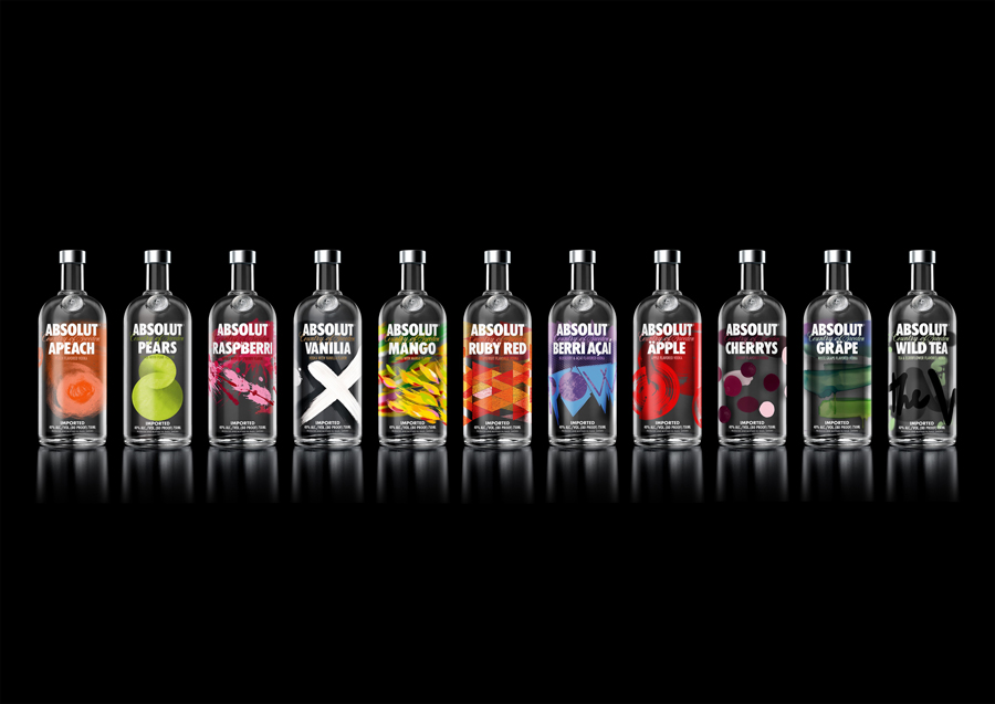 |
| Absolut Bottles |