A Look into the Vodka Industry

When you walk into a liquor store, you get blasted away with hundreds of artistically designed bottles and cans. Personally, I get overwhelmed with what to choose. When I am looking for a type of vodka to buy, I tend to go for the bottle that has the best design, or the most interesting design. In fact, there are numerous studies that show consumers are more drawn to the design, rather than the actual taste of the vodka. Usually, the design of the packaging represents the brand attributes of the company. For example, organic vodka will often have an environmental feel to it.

Frozen Ghost Vodka


There are so many different design elements that make up vodka packaging. First, there is the shape of the bottle. Some brands are becoming more creative with their bottles by making them look unconventional. For example, Crystal Head Vodka has a bottle that is in the shape of a skull. There is also Firestarter Vodka that looks just like a fire extinguisher. There are many different bottle shapes, sizes, and colors. But where does typography fit into this all? Does typography change as the target audience changes? Does typography change as the ingredients change? How does typography change as the bottle design changes? And why is it that the majority of typefaces used in vodka packaging design sans serifs? These are all important questions when looking into the world of vodka typography.


Crystal Head Vodka

  
Firestarter Vodka

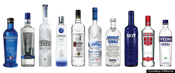
Before I get to typography, I want to give some background to the vodka market today. According to the Distilled Spirits Council’s Economic and Strategic Analysis Department, vodka is the most popular in the spirits industry, and generated over $5.5 billion in 2012. The interesting thing is that the super-premium brands had the most growth last year in the industry, and increased by 10% in volume. The three brands that hold the most marketshare are Absolut, Smirnoff, and Grey Goose. The top twelve brands in the vodka market are Smirnoff, Absolut, Ketel One, Skyy, Tito’s, Belvedere, Stolichnaya, Svedka, Grey Goose, Ciroc, Pinnacle and New Amsterdam. According to a package design audit by Affinova, the look of the packaging has more to do with purchase decisions than the actual taste of the vodka. Brands have either tried to stand out on the shelf, or remain true to their roots and keep their iconic designs.


10 of the Largest Vodka Brands

Sans Serif Typefaces

When looking at various vodka bottles, one can quickly notice that sans serif typefaces are almost always used. If not in all of the typography on the packaging, sans serif faces are often used in the word ‘vodka.’ It does seem to fit, too. The clean look of a sans serif font works well with the clean look of the clear alcohol. After doing some research, I discovered that the reason designers use sans serif typefaces for vodka packaging is in fact because it will fit with the pureness of the product itself. Graphics and typography are often skinned down to be clear and clean, just as vodka is clear and clean. An aged look and feel would not work for vodka typography like it would for scotch. Scotch itself is usually aged so the nostalgic typefaces fit well with scotch packaging. However, since vodka is pure and clean, sans serif faces and minimal graphics convey the product’s meaning quite effectively.

Effen Vodka


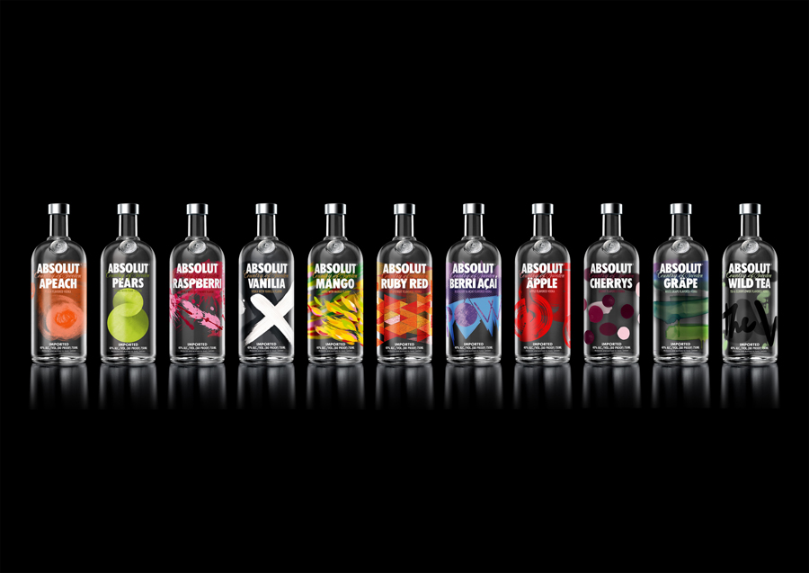
Absolut, the world’s leading vodka manufacturer, has not changed their typography since the beginning. Their stance on it is if it works, why change it? Even after Absolut came out with completely redesigned bottles that featured artful elements, their typography remained unchanged. This is effective not only for brand recognition, but it is also effective in just creating an extremely strong and powerful brand. It is like they are telling the world that they know they are the best, and do not need to change for anyone. Below is an image of their newly designed bottles that were created by an artist who used traditional art mediums such as paint and markers. He created abstract designs that not only fit together, but also resemble the flavor of each vodka.


Absolut Bottles

Historical Roots: U'Luvka Vodka

As with many products, some vodka typography is based off of the product’s historical roots. Since vodka got its origin in Russia and Poland, many popular types of vodka are made and distilled in one of those two countries. When the design firm Aloof was designing U’Luvka Vodka, they looked to the brand’s Polish roots for inspiration. The logotype for U’Luvka was actually referenced from one of the first recorded Polish typefaces, and then refined to make it unique and relevant to U’Luvka. Additionally, the pattern that is seen on their boxes was actually drawn by designers at Aloof, and referenced early 16th and 17th century Polish manuscripts. By using things from the brand’s geographical and historical roots, the design is that much more justified.

U'Luvka Vodka

Typographic Bottle Design: Anestasia Vodka

Not only do designers get typography inspiration from other things, but they also get inspiration from typography. When designer Karem Rashid was designing the bottle for Anestasia Vodka, he wanted to create a bottle shape that stood out on the shelves, and had a strong visual impact. He looked to typography to emphasize the visual impact, but not in a way you would expect. He thought of three letters that were very angular, and perceived as powerful. Those letters were K, V, and A. Coincidentally; those letters are all in the word vodka. Rashid played with those three letters until he had an interesting bottle shape that was powerful, assertive, and aesthetically pleasing. The bottle design he came up with is unlike anything else on the market. Also, once one knows the inspiration for the sensational bottle design, it is easy to see the resemblance of the letters in the angles of the glass.

Anestasia Vodka

Design and Brand Personality: Belvedere Vodka

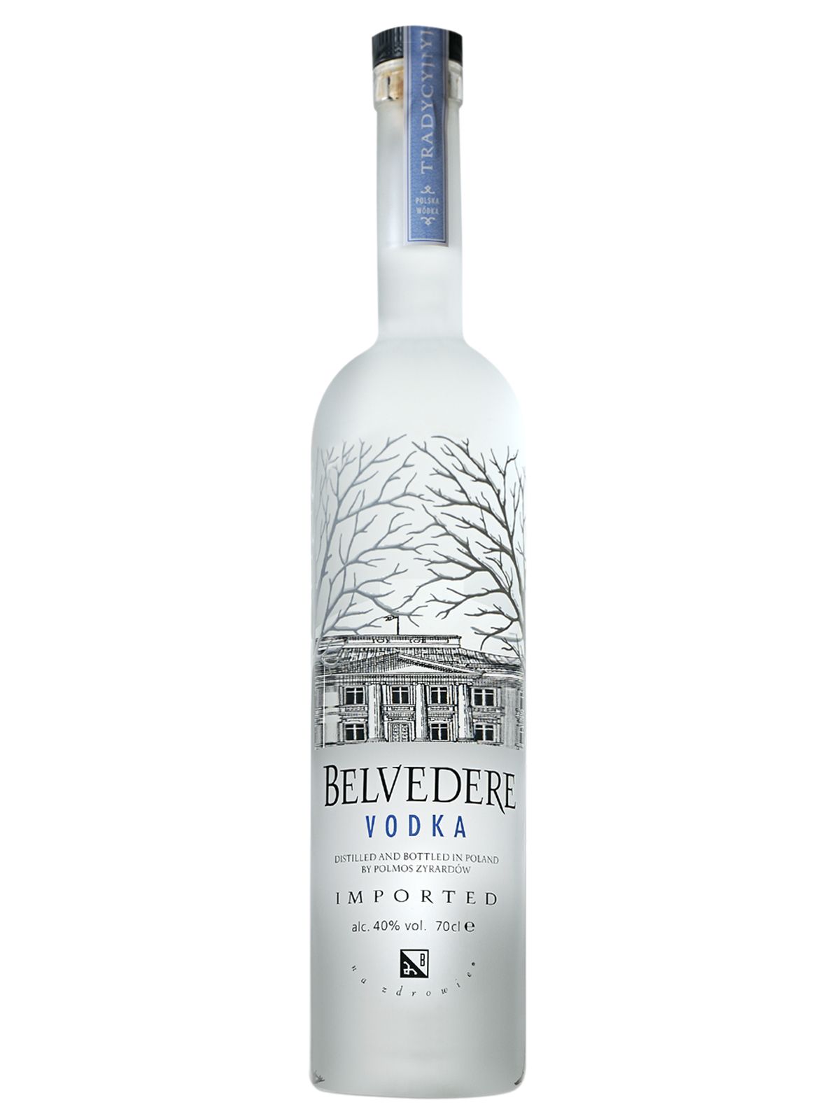
Belvedere Vodka
According to Affinova in their vodka package design audit, Belvedere vodka was a clear winner when it came to design and brand personality. Most people viewed Belvedere as intelligent, modern, and approachable. Participants in this study commented that the Belvedere packaging was stately, regal, and classy. When looking at the actual design, it is clear that their choice in typography has a lot to do with their brand perception and personality.

Belvedere mixes a variety of serif and sans serif typefaces to establish their regal look. The main logotype is a customized serif face that looks like it was modeled off of a historical typeface. In fact, it almost looks similar to U’Luvka Vodka’s typeface. This would make a lot of sense because they are both Polish vodkas, and are extremely proud of their geographical roots. Since U’Luvka’s logotype was modeled after one of the first recorded Polish typefaces, it would not be surprising if Belvedere’s logotype were also modeled after a similar ancient typeface. The Belvedere logotype also resembles the trees that are on the bottle. The R, V, and E’s are accentuated to mimic the sharp angles of the branches that line the top of the bottle. This creates unity in the design, and also emphasizes the intelligent and regal qualities of the design.

Besides their custom logotype, Belvedere uses a sans serif font as well. The sans serif is used in the word vodka, as well as the necessary information such as bottle size and alcoholic content percentage. Again, the sans serif is used in the word vodka to depict the pureness and cleanness of the product itself.


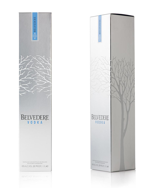
Belvedere Box Packaging

Design Examples

151º East Vodka


Frïs Vodka


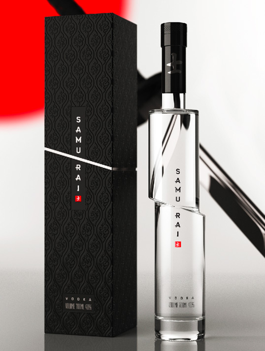
Samurai Vodka


Prairie Organic Vodka


Exclusiv Vodka


Double Cross Vodka


Karlsson's Vodka


DQ Vodka


References


"About Absolut." Absolut Ad. 1997. Web. <http://www.absolutad.com/absolut_about/history/story/>.

Gilpin, Lyndsey. "The 15 Coolest Vodka Bottle Designs That Aren’t Absolut." Food Dive. 12 Nov. 2013. Web. <http://www.fooddive.com/news/the-15-coolest-vodka-bottle-designs-that-arent-absolut/192433/>.

Hargreaves, Ben. Eat Me: Delicious, Desirable, Successful Food Packaging Design. Mies, Switzerland: RotoVision, 2004. Print.

Kozak, Gisela, and Julius Wiedemann. Package Design Now! Hong Kong: Taschen, 2008. Print.

Murray, Felicity. "Special Report: Vodka Packaging Design." TheDrinksReport.com. 5 Sept. 2013. Web. <http://www.thedrinksreport.com/news/2013/15045-special-report-vodka-packaging-design.html>.

"Vodka Packaging Audit." Affinova. Feb. 2013. Web. <http://www.boston.com/business/news/2013/09/04/for-vodka-brands-bottle-design-may-more-important-than-taste-affinnova-says/qanxwITFO7Qg4xdz9ATU6N/story.html>.