 |
| Belvedere Vodka |
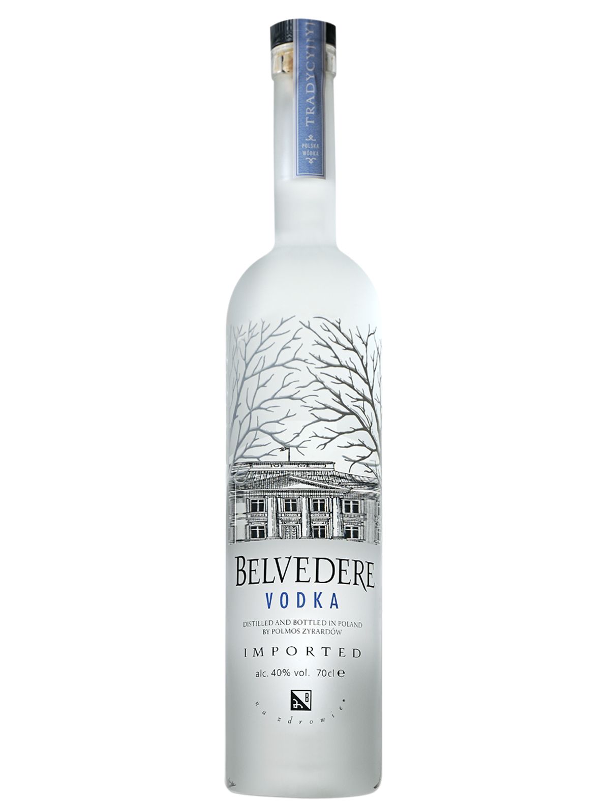
Belvedere mixes a variety of serif and sans serif typefaces to establish their regal look. The main logotype is a customized serif face that looks like it was modeled off of a historical typeface. In fact, it almost looks similar to U’Luvka Vodka’s typeface. This would make a lot of sense because they are both Polish vodkas, and are extremely proud of their geographical roots. Since U’Luvka’s logotype was modeled after one of the first recorded Polish typefaces, it would not be surprising if Belvedere’s logotype were also modeled after a similar ancient typeface. The Belvedere logotype also resembles the trees that are on the bottle. The R, V, and E’s are accentuated to mimic the sharp angles of the branches that line the top of the bottle. This creates unity in the design, and also emphasizes the intelligent and regal qualities of the design.
Besides their custom logotype, Belvedere uses a sans serif font as well. The sans serif is used in the word vodka, as well as the necessary information such as bottle size and alcoholic content percentage. Again, the sans serif is used in the word vodka to depict the pureness and cleanness of the product itself.
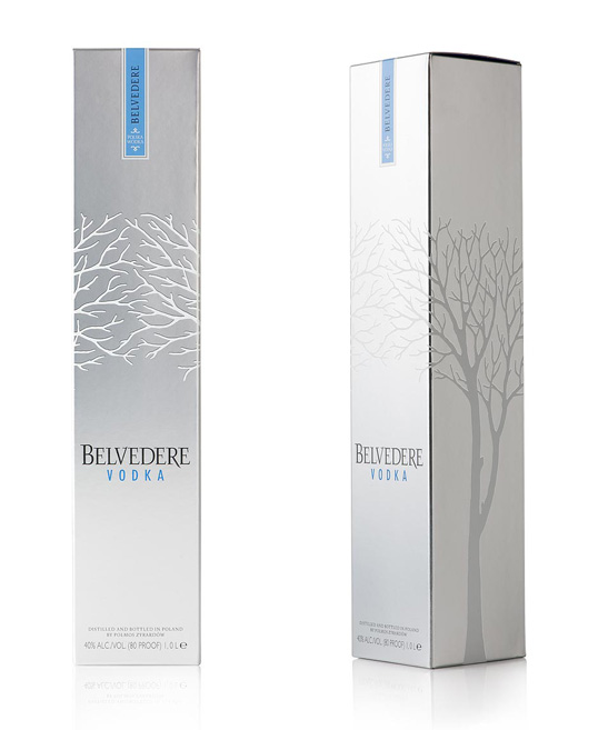 |
| Belvedere Box Packaging |